 |
Popup Specifications | |
| < Back to Home |
modified by Clarke Robinson on 10/20/00 |
|
|
Introduction The purpose of this guideline is to harness the collective experience gained from developing popups and improve their overall effectiveness going forward. Popups are a key traffic driver and are most effective when kept simple, clear and inviting. They should also reflect positively and help reinforce Netscape's brand image through the quality and consistency. We've developed this guideline for program managers and vendors responsible for creating the marketing messages and visual design. Popup Ad Examples Type Specs Ad Size Standardized Lockup Image Treatments Color Palette Available Artwork Technical Information Popup Ad Examples 
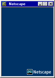
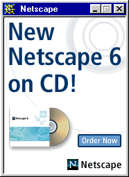 Back to top Type Specs All typography is Frutiger Condensed, upper/lower case (never use all caps) Headlines Frutiger 67 Bold Condensed No smaller than 28 pt No larger than 60 pt Subheads Frutiger 67 Bold Condensed No smaller than 16 pt No larger than 30 pt Feature List Frutiger 57 Condensed No smaller than 12 pt No larger than 14 pt Back to top Ad Size All ads should be 200 x 250 pixels. However, due to differences in display properties of different platforms it is necessary to keep all information within a smaller 175 x 225 pixel “image safe” area. 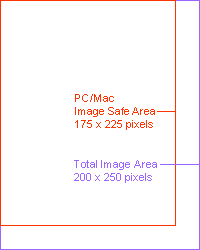 Windows platform - image size = 175 x 225 pixels  Unix platform - image size = 200 x 250 pixels  Back to top Standardized Lockup Layout requirements for Netscape popup ads are generally flexible, however the Netscape lockup must appear in the same place on all ads in the lower, right-hand corner of the popup. Also, in situations where the background of the popup is black or a dark color, the word "Netscape" must appear in white, and a 1-pixel white stroke must be placed around the logo. Graphic assets for both versions are on the files available for download below. 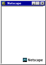
 Back to top Image Treatments In the interest of keeping file sizes down, photographic images should be used in moderation. When you do use photographs, in order to maintain a consistent style through all of our popups, a photograph must never appear as a square or rectangle. Always silhouette the main subject from the background as in the examples above and below. Like this:  Not this: Not this:  Back to top Color Palette The color palette is a subset of the standard 216 color web palette, and is used throughout Netscape.com. 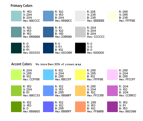 Back to top Available Artwork Artwork is available in Adobe Photoshop format. Files contain the Netscape Netcenter lock-up image and "safe-area" (Right Click and Save Link As..., or option-click for Mac): Netscape Popup for Mac (.sit file) Netscape Popup for PC (.zip file) If your popup requires a button, please refer to the specifications for using buttons on Netscape.com. An Adobe Photoshop version of the correct size button is available here (Right Click and Save Link As..., or option-click for Mac): Button19 Template for Mac (.sit file) Button19 Template for PC (.zip file) Back to top Technical Information All pop-up creatives need to measure 200 x 250 pixels with no links or buttons within 25 pixels of the bottom or right margin. This is a safe area to make sure that the information is visible across all platforms. Your pop-up will be rejected if this requirement is not met. All pop-ups need to be 1 single image (It will be image-mapped). Pop-ups can be no more than 12k. There will be only 1 "Call to action" in the pop-up creative (e.g., Sign Up Now or Register Now!) Your pop-up will be rejected if this requirement is not met. The final creative MUST be delivered at least 10 business days prior to the pop-up going live. We will review the creative, stage it, copyedit it, and send it through QA at this point. Back to top |
| Copyright © 2000 Netscape Communications | ||