|
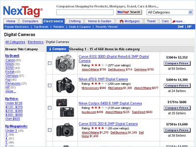
NexTag is very conservative about changes to their website. Not only were they vehemently against any alterations to their overall look & feel, and if the redesign hurt the financial performance of the site in any way at all it would be quickly scrapped.
I took an "evolutionary, not revolutionary" approach: I cleaned up the color scheme, removed superfluous design elements that bogged down the page, and made a few other subtle refinements. What resulted was a page that better represented the NexTag brand qualities of speed and efficiency, and generated 2% more revenue.
Full-size screenshots are here: before and after.
|
|
Before

click image to enlarge
After

click image to enlarge
|